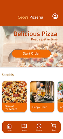
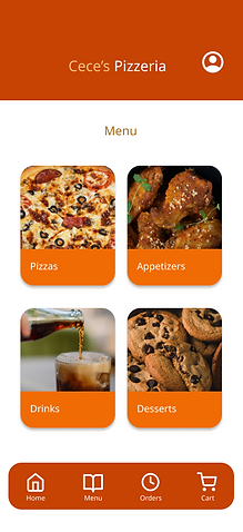
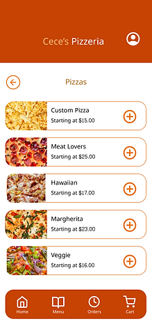
Cece's Pizzeria App
Product
A mobile ordering app designed to make ordering pizza feel simple, intuitive, and personalized.
Role
Solo UX designer
Problem
How might we create a pizza ordering experience that is fast and easy to navigate while giving users confidence in their order, control over their spending, and clear opportunities to review their selections before checkout?
Goal
Create an intuitive, transparent ordering experience that gives users confidence and control from customization through checkout.
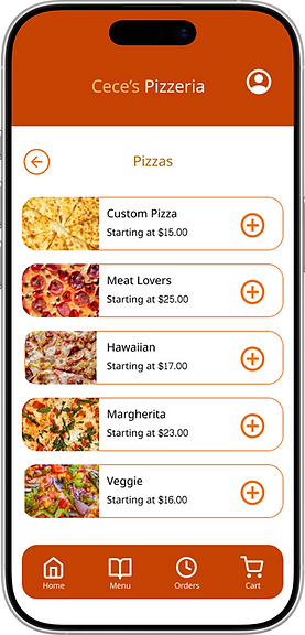
Understanding the User
I conducted my research using information provided by user bios. I analysed demographics such as the age, education level, and occupation of users, and their goals and frustrations. I then used my findings to better understand what users want to accomplish, what’s stopping them from achieving it, and how to create the most direct and efficient path to accomplishing that goal.
Pain Points
Accuracy
Time
Accessibility
Cost Efficiency
Personas
Using information from user bios, I analyzed demographics, goals, and frustrations to better understand users’ needs and behaviors. These insights helped me identify key pain points and develop two personas to guide design decisions toward a more accurate, efficient, accessible, and cost-conscious ordering experience.
![Google UX Design Certificate - Persona [Template] (2).jpg](https://static.wixstatic.com/media/42f6e4_091f1bd6fd7846e8adb1aef3c80f6f9a~mv2.jpg/v1/fill/w_407,h_229,al_c,q_80,usm_0.66_1.00_0.01,enc_avif,quality_auto/42f6e4_091f1bd6fd7846e8adb1aef3c80f6f9a~mv2.jpg)
![Google UX Design Certificate - Persona [Template] (1).jpg](https://static.wixstatic.com/media/42f6e4_8cf36dbf030541d58602c2a752a2815a~mv2.jpg/v1/fill/w_407,h_229,al_c,q_80,usm_0.66_1.00_0.01,enc_avif,quality_auto/42f6e4_8cf36dbf030541d58602c2a752a2815a~mv2.jpg)
The Approach
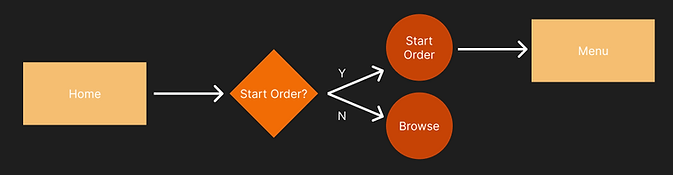
I created three user flow diagrams to map out the steps users take when creating an account, starting an order, and customizing a pizza. These flows helped identify key decision points and ensure each task follows a clear, intuitive path from start to finish.
User Flow: Create an Account

User Flow: Start an Order for Take Out
User Flow: Create a Custom Pizza and Add it to the Cart

Wireframes
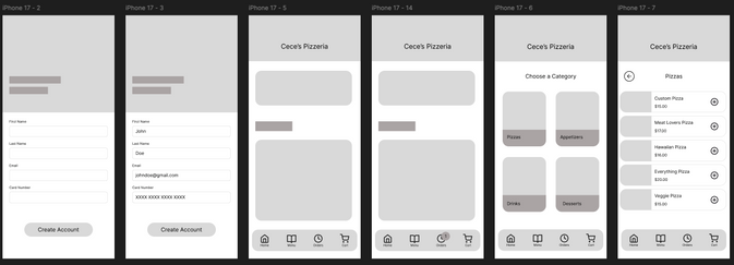
Using Figma, I designed wireframes for each of the necessary screens.Throughout the user flow, I designed each screen to be simple, readable, and easy to navigate. I incorporated imagery to improve accessibility, help users quickly identify options, and create a seamless ordering experience from start to finish.
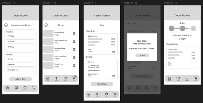
Low-Fidelity Prototype
In Figma, I connected my screens into a responsive prototype. My low-fidelity prototype includes pages for essential tasks such as creating an account, browsing the menu, placing an order for pick-up, and tracking the status of an order.
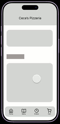
Usability Study
I tested the ordering experience through two rounds of usability studies, using participant feedback to refine the experience along the way. Testing revealed opportunities to improve customization, order flexibility, and navigation.
Round 1 Insights
Customers want more precise control over topping quantities
Users want flexibility to make last-minute changes and additions to their order
Users found the ordering process intuitive and easy to navigate
Sticker Sheet
After conducting my first round of usability testing, I created a sticker sheet of buttons, graphics, and images with consistent branding to be used in my high-fidelity prototypes.
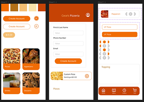
High Fidelity Prototype
In Figma, I designed high-fidelity prototypes replacing filler text and images with components created in my sticker sheet. I used the feedback from my first usability test to improve and inform the user flow and look of each screen.
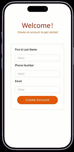
Usability Study
The second round of usability testing revealed opportunities to improve customization, order flexibility, and navigation.
Round 2 Insights
Visual emphasis on the homepage distracted users from the primary navigation
Users valued a frictionless checkout that did not require saving payment information
The primary ordering CTA needs stronger visual emphasis
Final Design
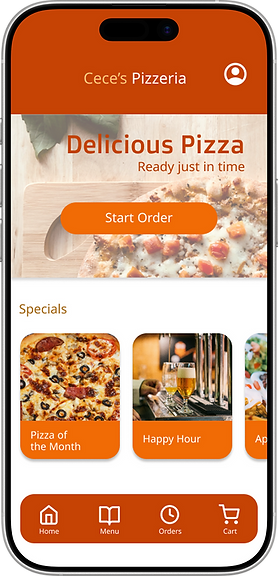
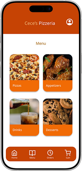
Based on usability testing, I refined the home page to make starting an order more obvious. Since users navigated the ordering flow successfully and responded positively to the navigation and visual design, I focused on improving the visibility of this key action while maintaining the existing design.